New This Week: 6 Beautiful Bedrooms
Improve a bedroom with a neutral color palette, four-poster bed and other details shared by pros
There’s no single right formula for creating a stylish bedroom. But the following new bedrooms from designers on Houzz offer some starting points. See if an inviting neutral color palette, layers of texture and decor or maybe a four-poster bed or fireplace is what you’ve been looking for to complete your bedroom style.
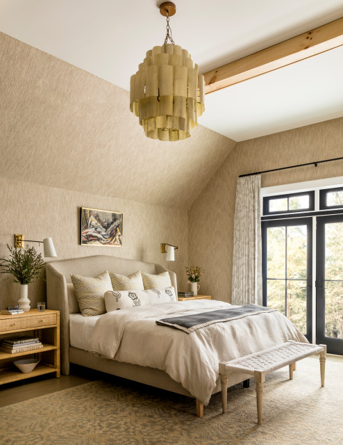
2. Woven Walls
Designer: Marisa Lafiosca of ML Interior Designs
Location: New Providence, New Jersey
Size: 428 square feet (40 square meters)
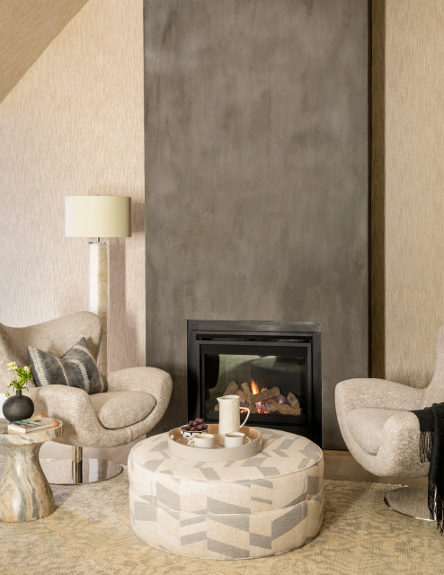
Homeowners’ request. For the bedroom in this new-build home, the owners wanted a calming color palette and a fireplace.
Main feature. Textured wallcovering (Woven Wicker in Beige Basketweave by Phillip Jeffries).
Shop for bedroom furniture
Other special features. Fireplace with faux plaster painted surround and a seating area for reading. Pitched ceiling with wood beams. Hand-knotted rug. French doors.
Designer tip. “Add texture with a grasscloth-type wallcovering to make a space feel warm and enveloping,” designer Marisa Lafiosca says.
7 Tips for Designing Your Bedroom
Designer tip. “Add texture with a grasscloth-type wallcovering to make a space feel warm and enveloping,” designer Marisa Lafiosca says.
7 Tips for Designing Your Bedroom
3. Ocean Origins
Designer: Amy Hilliker Pope of The Design Project
Builder: Mancuso Development
Location: Corolla, North Carolina
Size: 243 square feet (23 square meters)
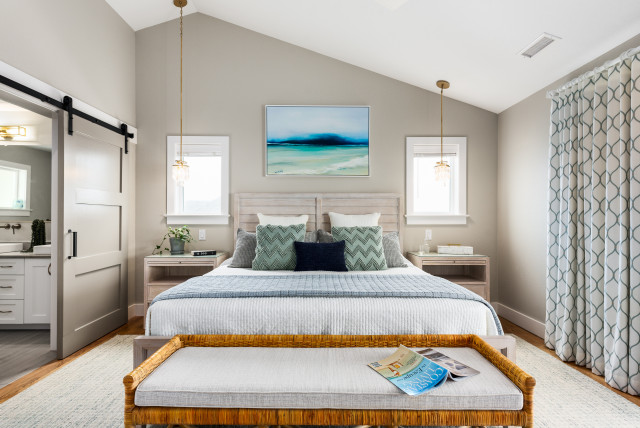
Homeowners’ request. “This was a new-construction project and the whole room was set up to take advantage of the ocean views,” designer Amy Hilliker Pope says. “We wanted this room to feel luxurious. Having a coastal feel to the furniture and decor was the most important element in the space, and I feel we created that with the color palette and textures.”
Main feature. “Everything is set up to take advantage of the view of the ocean,” Pope says. “The bed is situated to look out the large glass sliding doors over the ocean when in bed. We mirrored the view from outside in the artwork over the bed.”
Other special features. The walls are painted Worldly Gray by Sherwin-Williams. The floors are oak. “We loved using rattan throughout the home and have included a rattan bench (and rattan armchair with ottoman) to bring this element into this space as well,” Pope says. “The pendant lights over the nightstands allow there to be more free space on the nightstand that would otherwise be taken up by a lamp.”
Designer tip. “If you have a sloped ceiling, always make sure to select light fixtures and ceiling fans that will work with a sloped ceiling,” Pope says. “Not all fixtures will.”
“Uh-oh” moment. “It’s always important to keep in mind that when you get new furniture, you need to make sure you can get it through the front door and up the stairs,” Pope says. “The bed frame was tough to navigate through the stairway and we thought we might have to use a crane to lift it over the deck railing on the third floor that does not have an exterior stair from the ground level. But we found a way and did not need the crane.”
Project photography: Elizabeth Neal of Milepost Living Photography
Need a pro for your home remodeling project?
Let Houzz find the best pros for you
Let Houzz find the best pros for you
4. Pink Positive
Designer: Claire Evelyn of Trim Spaces
Location: Washington, D.C.
Size: 200 square feet (19 square meters)
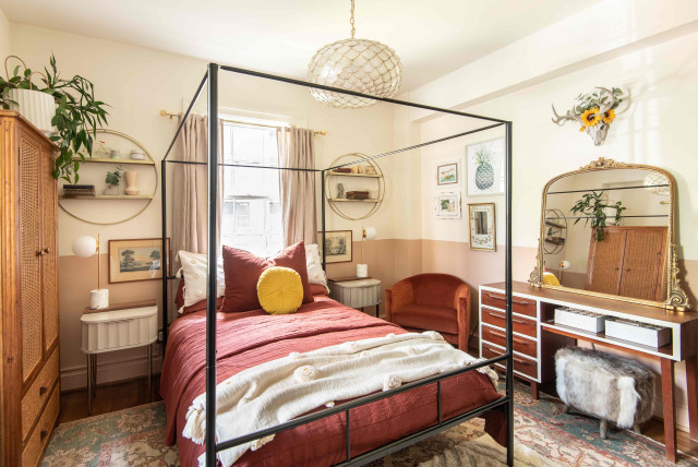
Homeowner’s request. “The homeowner wanted a relaxing space that also was an expression of her creativity,” designer Claire Evelyn says. “The overall theme was an eclectic mix of her favorite things and colors and a focus on deep, warm tones and purpose-driven functional furniture. Her previous setup did not make her feel welcomed or relaxed in her own bedroom and she wasn’t able to do everything she wanted to in the space. I felt focusing on what she wanted to be able to use the space for and how she wanted to feel in it would solve the problem. So we focused on sleeping and relaxing, a space for yoga, a space for getting ready and storing her skincare, and a corner for reading.”
Main feature. “Taking a little risk and painting just the bottom half of the walls pink was a significant decision,” Evelyn says. “We wanted to keep the space playful, even though it’s designed for an adult. The pink tone set the color palette moving forward and we decided to go with rich auburn colors that would pop against the pink.”
Other special features. “The four-poster bed frames the room well and brings the eyes upward, drawing attention to the high ceilings,” Evelyn says. “It also creates a purposeful space for a chandelier that brings warmth to the room. The velvet of the corner chair and shag cowhide-inspired pouf at the vanity bring interesting textures to the space. The eclectic collection of decor was balanced out with classic pieces like a midcentury vanity, Oriental rug and rattan armoire.”
Designer tip. “Layer rugs,” Evelyn says. “The Oriental rug fit well with the color palette and gave a good base but was not truly her style. So we added a geometric white shaggy rug that gave the room a little something special.”
“Uh-oh” moment. “We started off with a different bed,” Evelyn says. “We originally found a headboard that was wood with intricate medallions. While she loved the piece, the neutral color of the headboard was completely lost in the space. So we started back at square one focusing on a black frame that would contrast with the space. Being the only metal and black piece in the room, it stands out nicely while also being delicate and not taking up a lot of room.”
5. Carpet Kickoff
Designer: Laura West of Mineral City
Location: Ponte Vedra Beach, Florida
Size: 882 square feet (82 square meters)
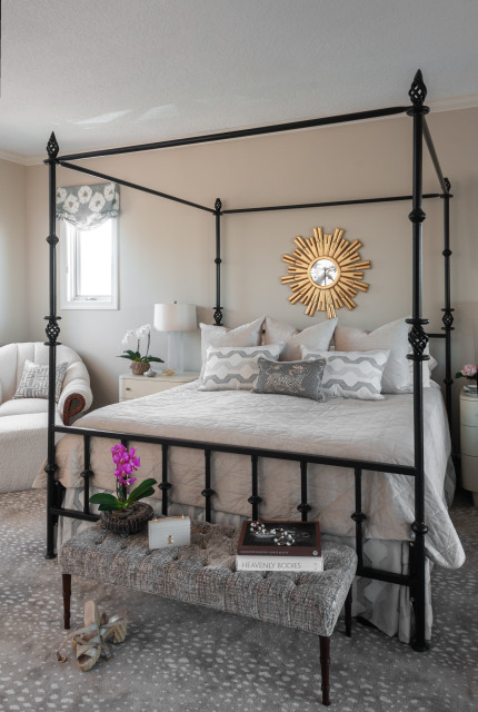
Homeowners’ request. “The homeowners requested a bedroom that would serve as a calm and peaceful way to begin and end their day,” designer Laura West says. “The bedroom project began as a follow-up to the renovation of the master bathroom, for which we chose marble with pronounced gray veining as a dramatic yet tranquil focal point. After completing the bathroom renovation, the homeowners and I decided that the master bedroom needed a refresh to blend the two rooms together and create a cohesive retreat from their busy lifestyle with grown children, grandchildren and a new puppy.”
Main feature. “We first selected the Stark Antilocarpa carpet, which serves as the glue that binds the bathroom (more cool gray) and the bedroom (more warm beige) together,” West says.
Other special features. “The centerpiece of the bedroom is the wrought iron bed, which the homeowners wanted to keep and I needed to integrate into the design,” West says. “It ended up serving as the grounding force in the room, and then I added the gold starburst mirror to soften the hard geometric angles of the bed frame. We also reupholstered a wicker chair cushion with an ivory bouclé fabric.”
New to home remodeling? Learn the basics
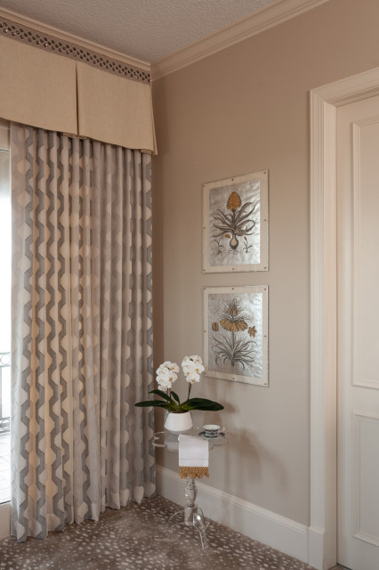
West refreshed an existing valance with a Kate Spade trim to add a bit of glamour. The sheers are a Kravet fabric called Elevated in a pewter color. “We actually used a lined version of the sheer fabric on the bed skirt because the client loved it so much,” West says. Hand-painted metallic botanical prints add more glam.
Designer tip. “When working with a monochromatic palette, it’s important to realize that texture plays a large role in giving the room personality and warmth where variation in color is less present,” West says. “Velvets mixed with raffia and ephemeral embroidered fabrics provide visual interest, as does mixing metals — gold and brass add warmth to gray and chrome color palettes.”
Wall paint: Kilim Beige, Sherwin-Williams
6. Teal Zeal
Designer: Emily Yoakum of E. Yoakum Interiors
Location: Chattanooga, Tennessee
Size: 324 square feet (30 square meters), 18 by 18 feet
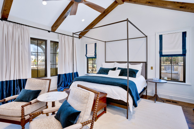
Homeowners’ request. “The homeowners wanted their room to feel like a retreat, as if they were staying in a high-end hotel,” designer Emily Yoakum says. “They have a love for jewel tones and contemporary styling but also wanted to meld that with the warmth of rich woods and stone. They really trusted my vision with design to achieve the feeling they want to escape to.”
Main feature. “The focal point in this room is a stone fireplace and the timber ceiling beams,” Yoakum says. “Once we nailed down the look and finish of those items, we supplemented the rest of the room with neutrals and a punch of the deep teal velvet on the drapery and bedding to really elevate the style and create a contrast from the more rustic elements.”
Other special features. “We wanted this room to have a neutral palette, so we used Benjamin Moore’s Vanilla Milkshake on both walls and ceiling and contrasted that with dark floors and beams,” Yoakum says. “The high contrast and accents of deep teal bring an interest to the space but allow it to still feel like a tranquil space for relaxing and sleeping. The chest at the foot of the bed is an heirloom piece passed down from generations that we knew we needed to incorporate in this room.”
Designer tip. “The block-style drapery where the color block is lined up with the base of the windows is something I did for the first time on this project and love the added detail it brings,” Yoakum says. “It allows for a pop of color without it being overpowering but also complements the architecture of the house and room by accentuating the windowsill line.”


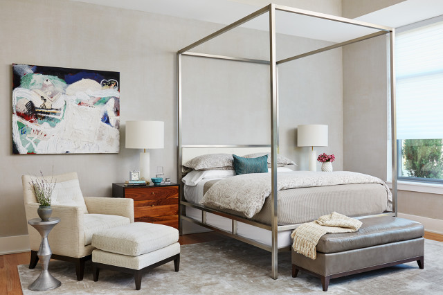
Designer: Suzanne Manlove of Manlove and Co. Interiors
Location: Alexandria, Virginia
Size: 286 square feet (27 square meters)
Homeowners’ request. “Our clients wanted a design that diligently stuck to the spirit of their home — spare, modern and high-quality — and also was composed to showcase their extensive international art collection,” designer Suzanne Manlove says. “The challenge was to establish a calm elegance to the decor that did not compete with their art.”
Main feature. “The primary bedroom is a study in neutrals, where each piece makes a statement in hushed tones,” Manlove says. “The star of the show is a custom metal four-poster bed by Washington, D.C., architect and designer Hugh Newell Jacobsen that adds architecture and height to the tall space.”
Other special features. “The custom walnut nightstands by Elijah Leed add a warm glow to the space,” Manlove says.
Designer tip. “Don’t be afraid to mix fabrics and textures — especially in a room full of neutrals — to keep things interesting,” Manlove says. “We chose complementary patterns for the chair and ottoman.”
Find an interior designer near you